How can Telehealth education improve medication adherence in chronic disease patients in Jordan?
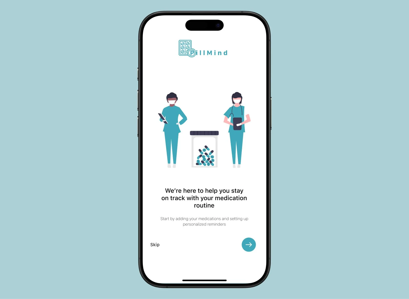
An engaging, narrative-based telemedicine experience intended to enhance patient comprehension and medication compliance. In a narrative, patients make decisions regarding their medication regimens and receive tokens for their choices. Every token includes a QR code that, when scanned, yields statistics based on their selections. These statistics serve as helpful reminders of the significance of adherence and can be saved as wallpapers. Patients are given a take-home leaflet at the end of the experience that includes simple advice on how to remember to take their medications on time. Additionally, the leaflet contains a QR code that guides patients to an app that allows them to view medication schedules, set reminders, and access more educational materials.
Design Process
Market Research
My next step was an in-depth exploration of the telemedicine market in Jordan to identify opportunities and challenges. Jordan’s healthcare landscape offers potential for telemedicine to bridge gaps between urban centers and rural areas, but significant barriers remain.
24/7 access to consultations and health content but lacks in-depth specialty care.
Government-supported with multilingual capabilities but limited availability outside business hours.
Integrated with national EHR systems but lacks focus on real-time consultations and is complex for non-tech-savvy users.
Survey Insights
To gather user insights, I distributed surveys in Arabic to participants from rural Jordan. Conducting the survey in Arabic ensured cultural validity and minimized response bias.
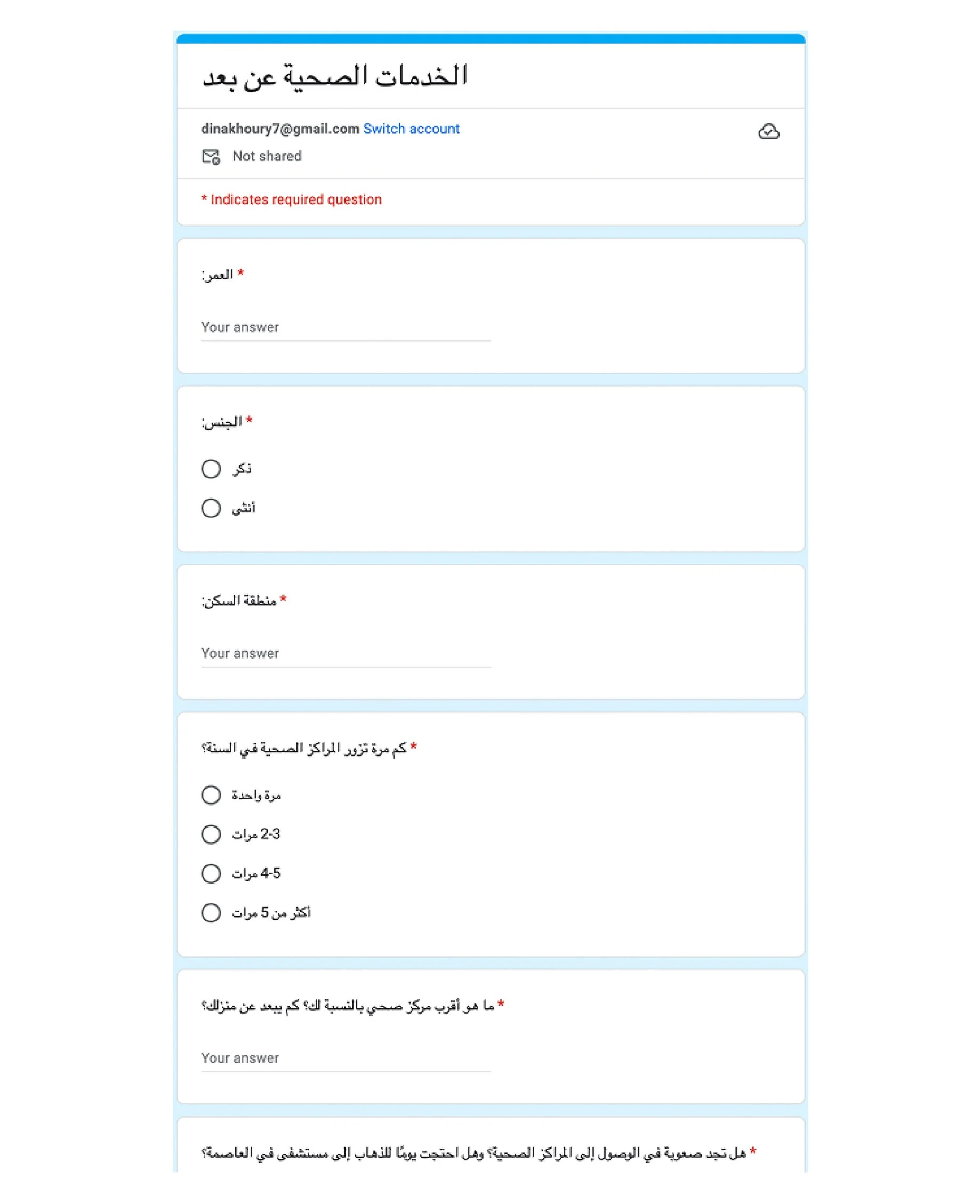
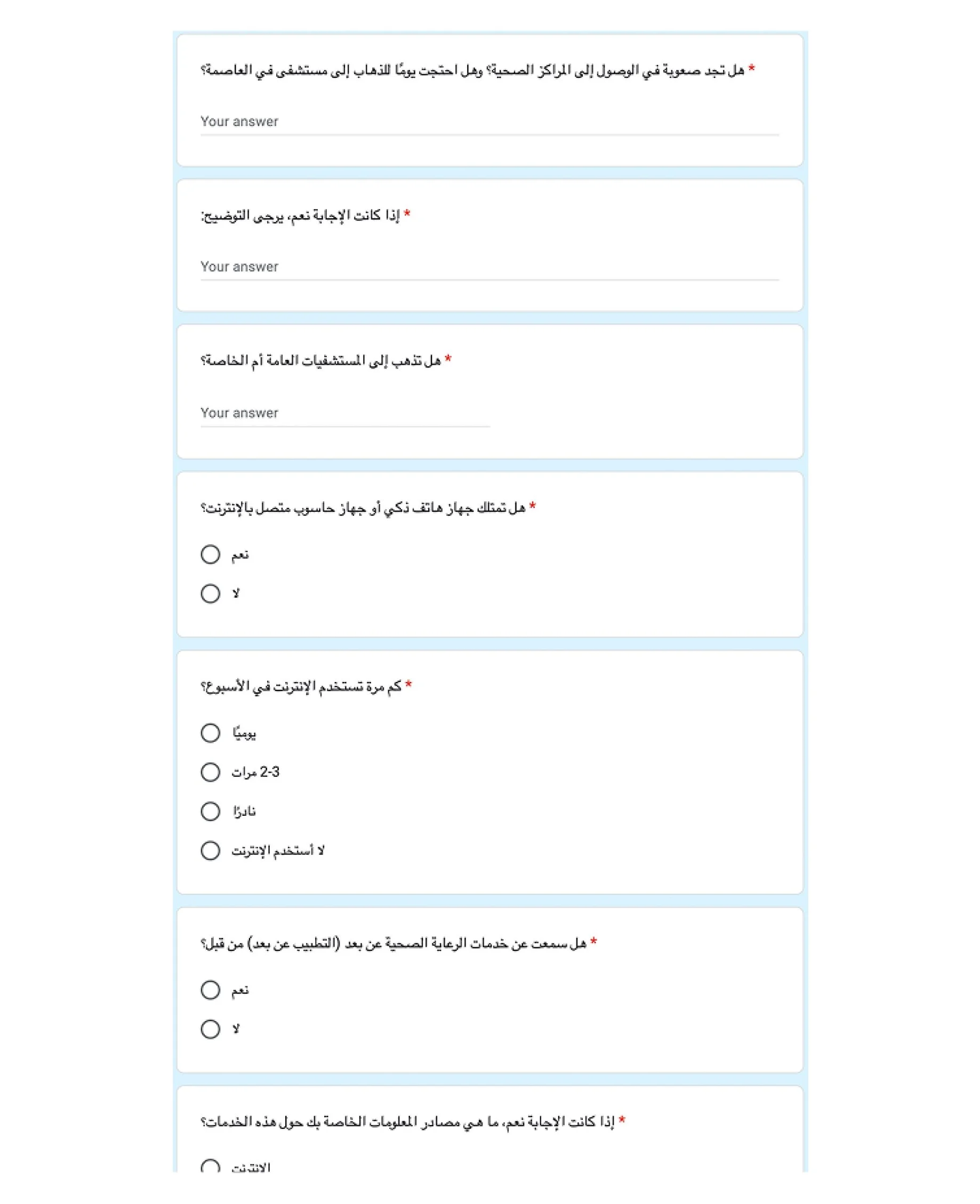
Results highlighted barriers such as:
Lack of trust in telemedicine.
Technological challenges.
Strong interest in services like medical consultations and medication requests.
Artifact Evaluation
To explore the usability of existing telemedicine solutions, I analyzed Altibbi, a popular Telehealth app in Jordan.
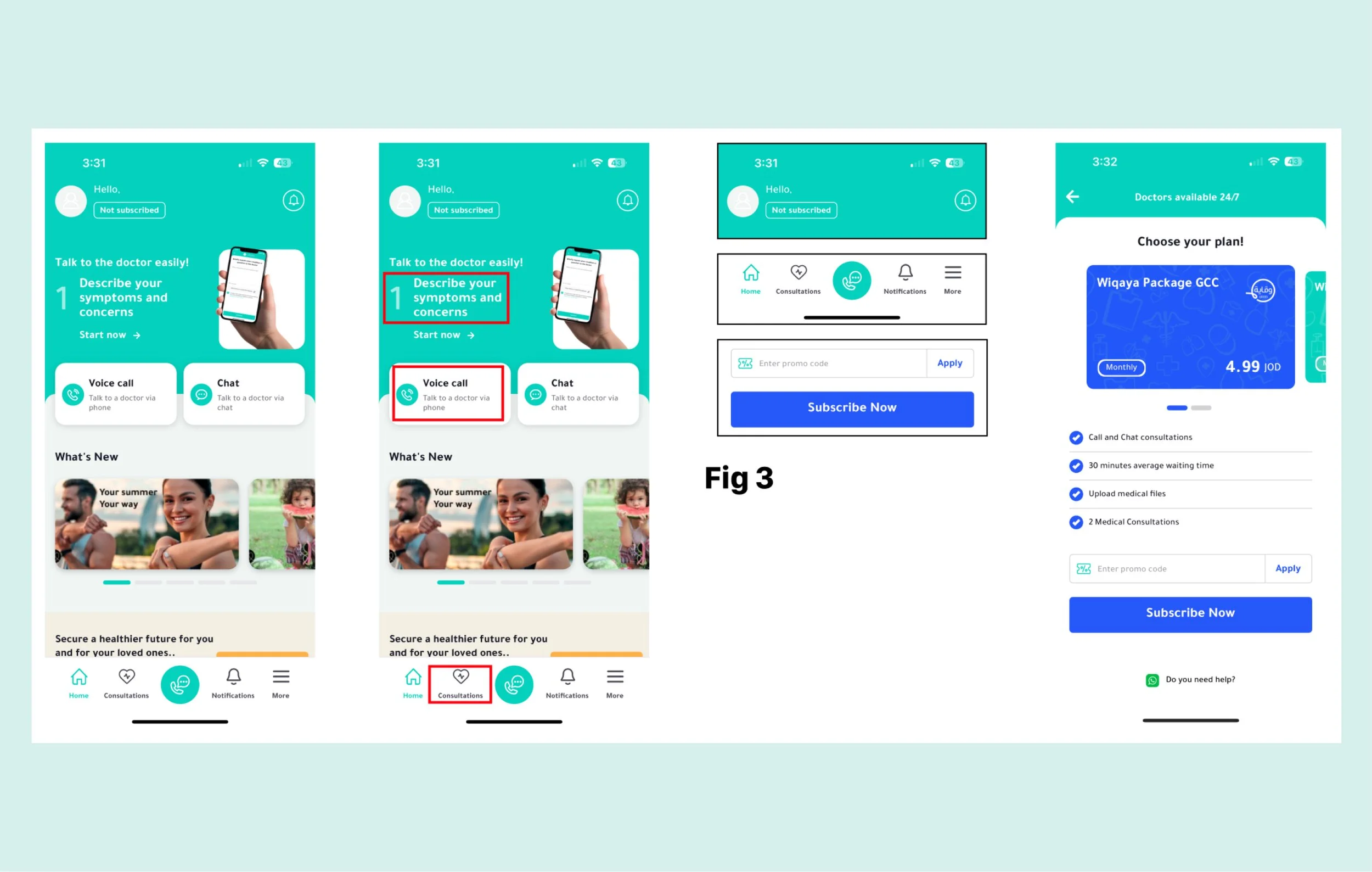
Strengths: Clear typography, intuitive navigation, and responsive elements.
Weaknesses: Limited contrast for visually impaired users and small font sizes for older adults.
This analysis informed my approach to designing accessible, user-friendly platforms.
Artefact Analysis
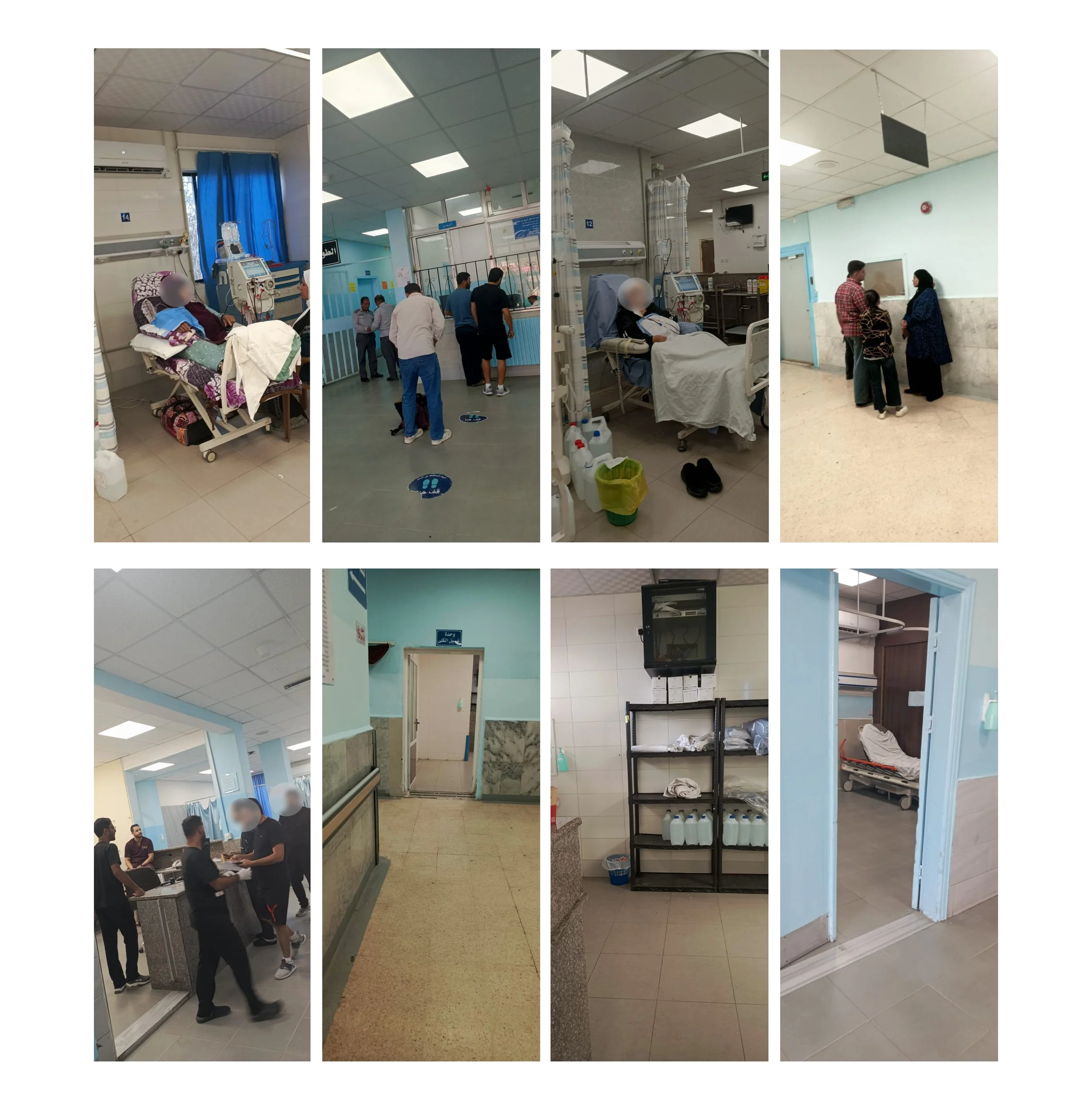
Conducting an AEIOU analysis at a Ministry of Health facility revealed systemic issues:
Activities: Disorganized processes and delayed medication dispensing.
Environments: Poor maintenance, overcrowding, and inadequate medical equipment.
Interactions: Minimal communication between doctors and patients, with limited privacy during consultations.
Objects: Outdated medical equipment and confusing medication labels.
Users: Patients reported frustration with long wait times and lack of respect from staff.
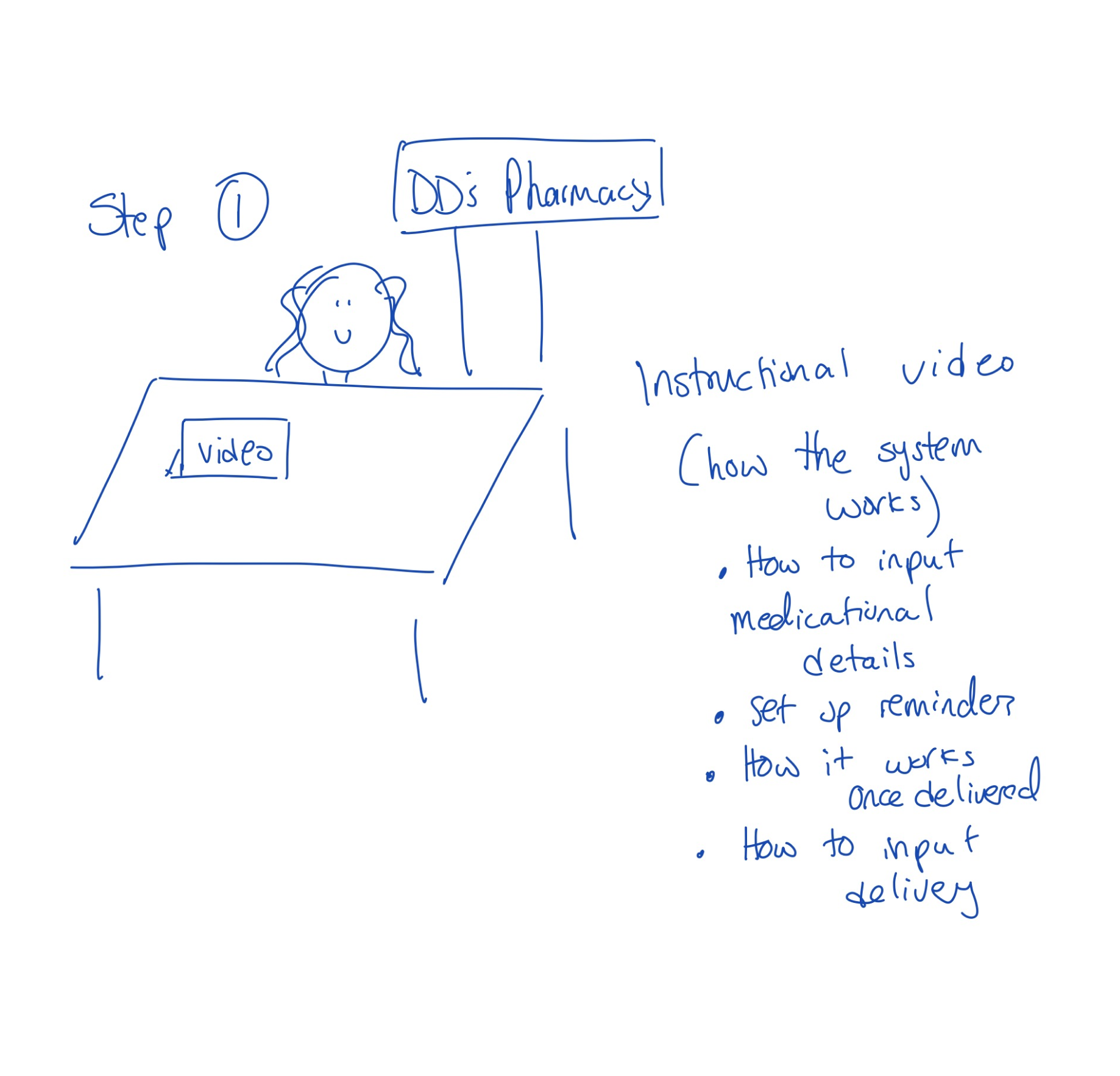
Interview with Pharmacist Nisreen Stephan
To understand the needs of Jordanians, I conducted a survey, interviews, and storytelling sessions. Key findings include:
Medication Adherence Barriers: Survey respondents highlighted distance to pharmacies, trust issues, and unclear instructions as major challenges.
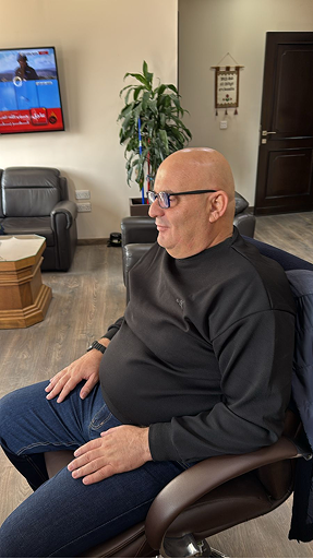
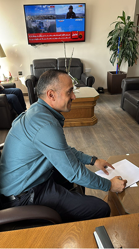
Cultural Context: During an interview, pharmacist Mrs. Nisreen Stephan (See Fig 1) emphasized the reliance of rural patients on pharmacists over remote doctors. She also noted:
Telepharmacy can build trust in remote systems.
Rural patients face medication adherence issues due to unclear instructions and limited pharmacy access.
She mentioned that “Many rural patients trust pharmacists more than remote doctors, making Telepharmacy a reliable entry point.”
In storytelling sessions, participants shared their challenges:
"I couldn’t get my meds for a week because the pharmacy was too far."
"The instructions are confusing, and I sometimes take medication incorrectly."
Market Analysis
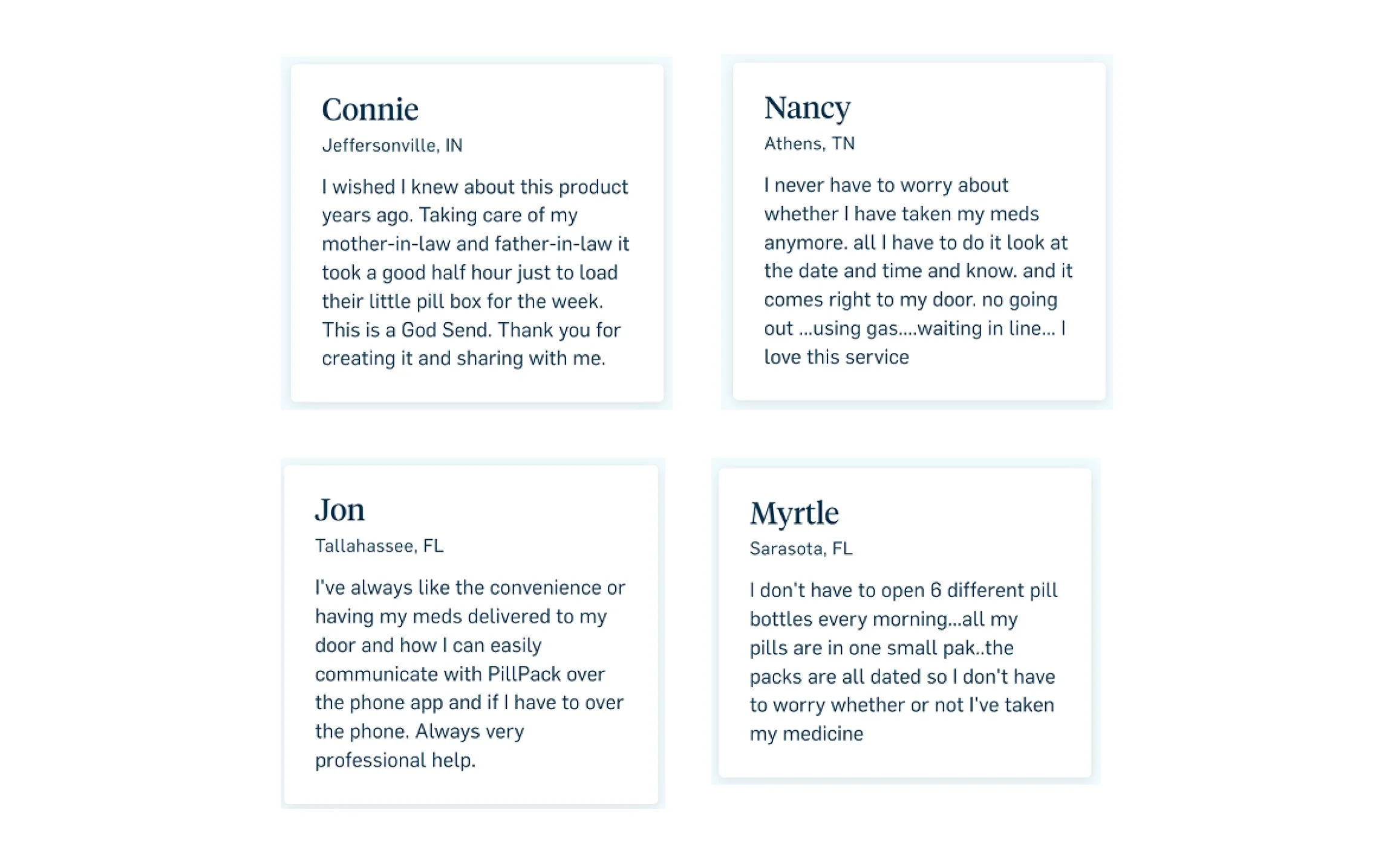
PillPack by Amazon Pharmacy
Upon reassessing, I realized a medication delivery kit could benefit not only rural patients but also chronic disease patients, the elderly, busy professionals, parents, and people with disabilities. Coming from a family with chronic conditions (thyroid issues, insulin resistance, osteoporosis), I conducted a survey in Jordan to explore the prevalence of chronic diseases. I distributed it in English via Instagram and WhatsApp, gathering key insights.
Speed Dating
Participants: 5 individuals tested different packaging concepts.
Feedback: Participants enjoyed creative labels like "Energy Pills" but expressed concerns about confusion and clarity.
Quotes:
Participant 1: “I love the fun design, but I wish it was clearer what medicine this actually is.”
Participant 2: “The packaging makes it look less intimidating, but I need the actual medical name somewhere.”
Limitations: Lack of clear labeling could compromise safety.
Directed Storytelling
Participants shared medication challenges, including unclear instructions and struggles remembering doses. They was asked to recount a time when managing their medication was particularly difficult.
Feedback:
While most participants liked the fun, creative labels, they also felt that these names could confuse patients about which medication they were taking.
Quote from Participant 1: “I like the creative names, but I want the medical name to be more visible.”
Quote from Participant 2: “It’s easier to remember my pills when they’re fun to look at, but I’m worried I’ll forget what the actual medication is for.”
Advantages: Personalized designs increased emotional engagement.
Limitations: Creative labeling could lead to misidentification of medications.
Design Concept: Telemedicine Hub
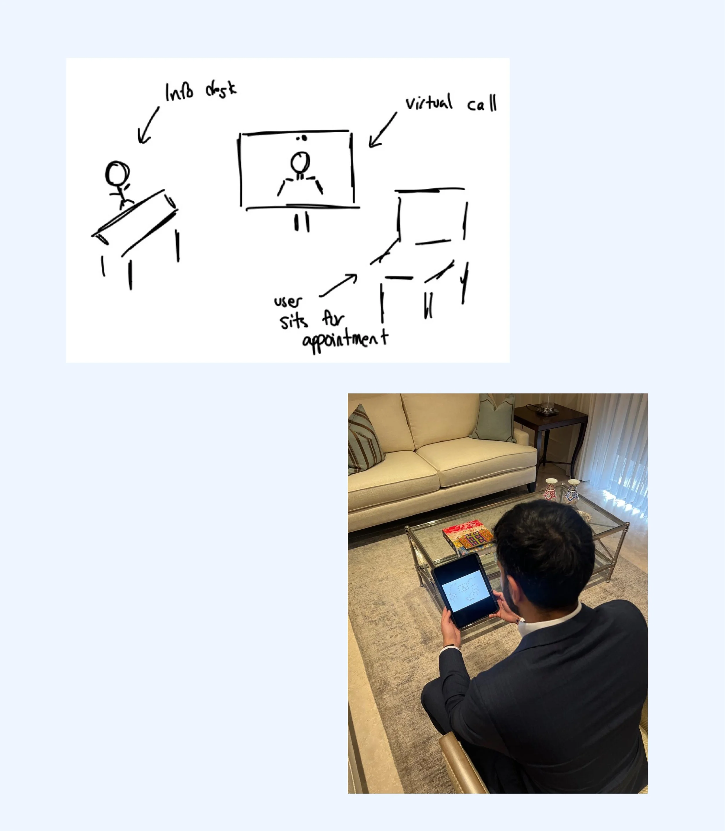
My proposed solution is a Telemedicine Hub set up in rural areas. These hubs include:
Medical tools, tablets/computers for teleconsultations, and a receptionist to assist patients.
A system for follow-up appointments and connecting patients with specialists.
Idea Validation and User Feedback
After proposing the concept to participants from rural areas, I received constructive feedback:
Accessibility for those with limited mobility is essential.
Concerns about technical issues and internet reliability were raised.
The inclusion of specialist consultations and follow-ups was highly encouraged.
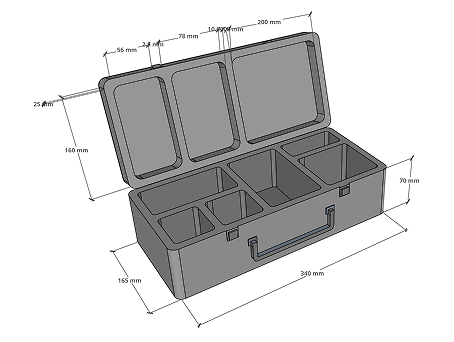
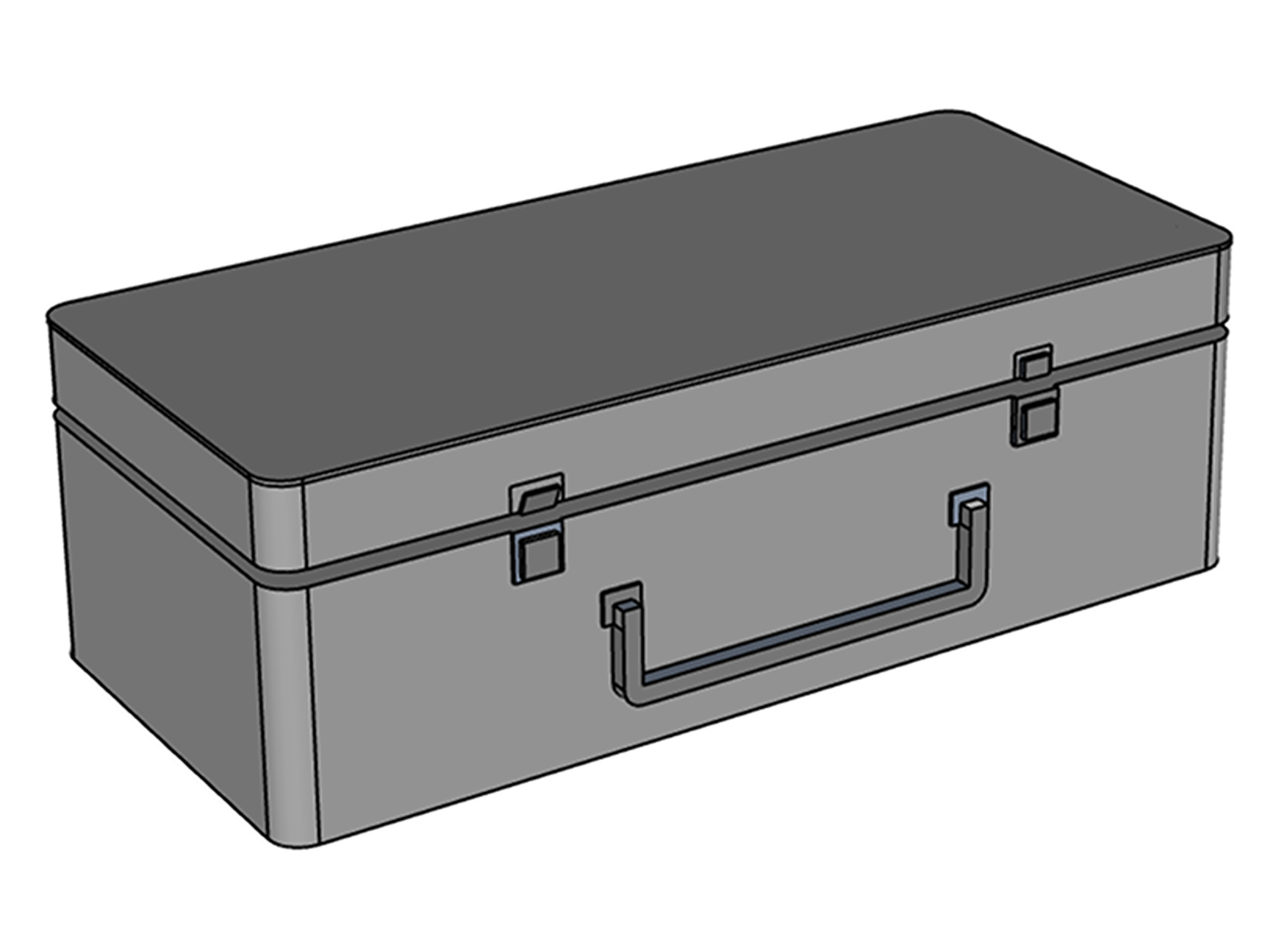
Design Shift: Telemedicine Toolbox
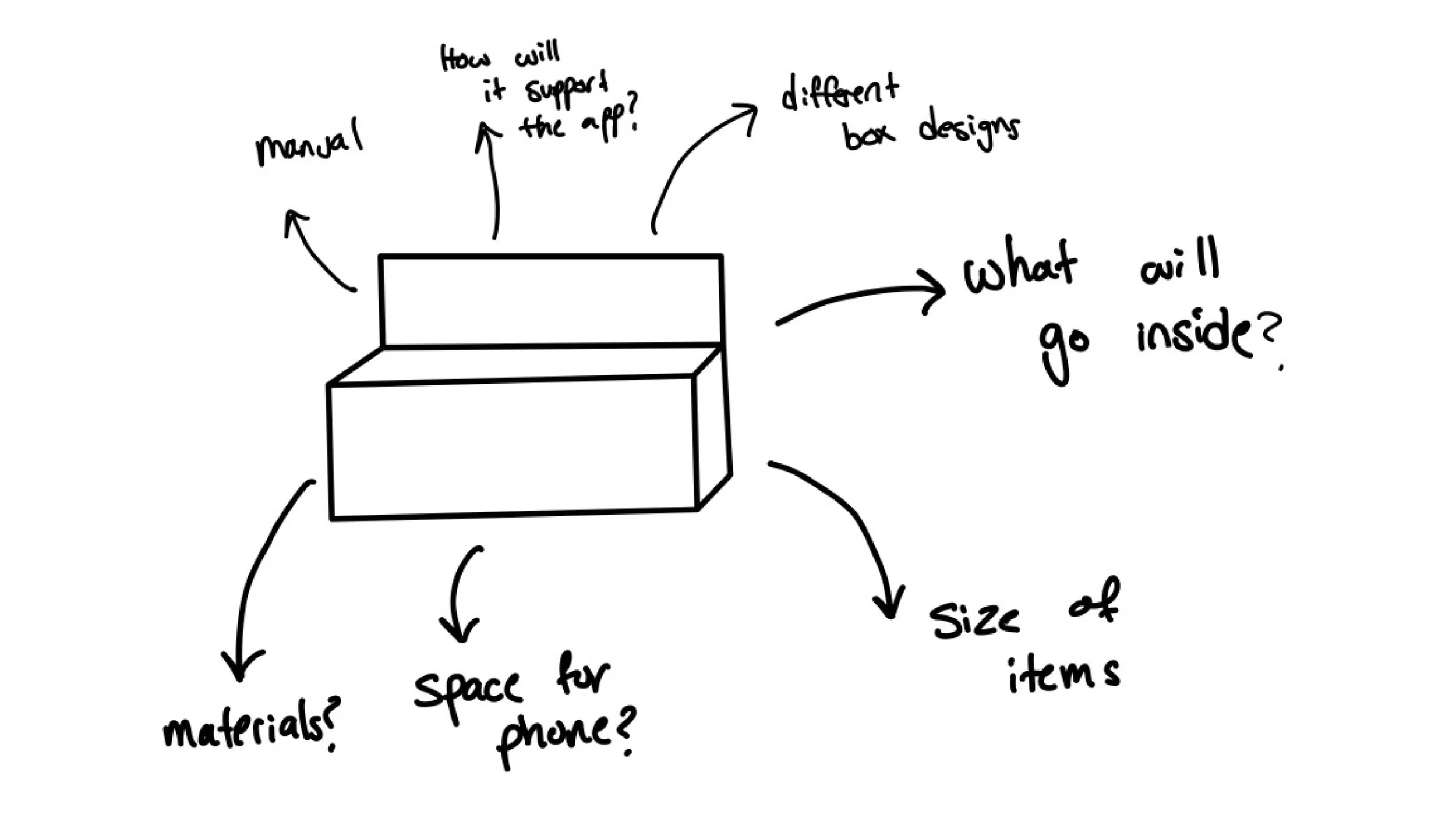
This week, my focus shifted toward designing a Telemedicine Toolbox, a physical component aimed at complementing digital health solutions. The toolbox concept addresses the need for accessible healthcare tools, especially in rural and underserved areas in Jordan. The process explored feasibility, prototyping, and user needs, leading to iterations that balanced functionality, simplicity, and portability.
Design Concept and Challenges
The initial sketch explored various design possibilities, including:
Size constraints to ensure portability and ease of use.
Modular compartments for storing essential medical tools.
Space allocation for integrating a smartphone or tablet to enable telemedicine calls.
Challenges arose around balancing compactness with capacity, ensuring the box could house essential tools without being cumbersome.
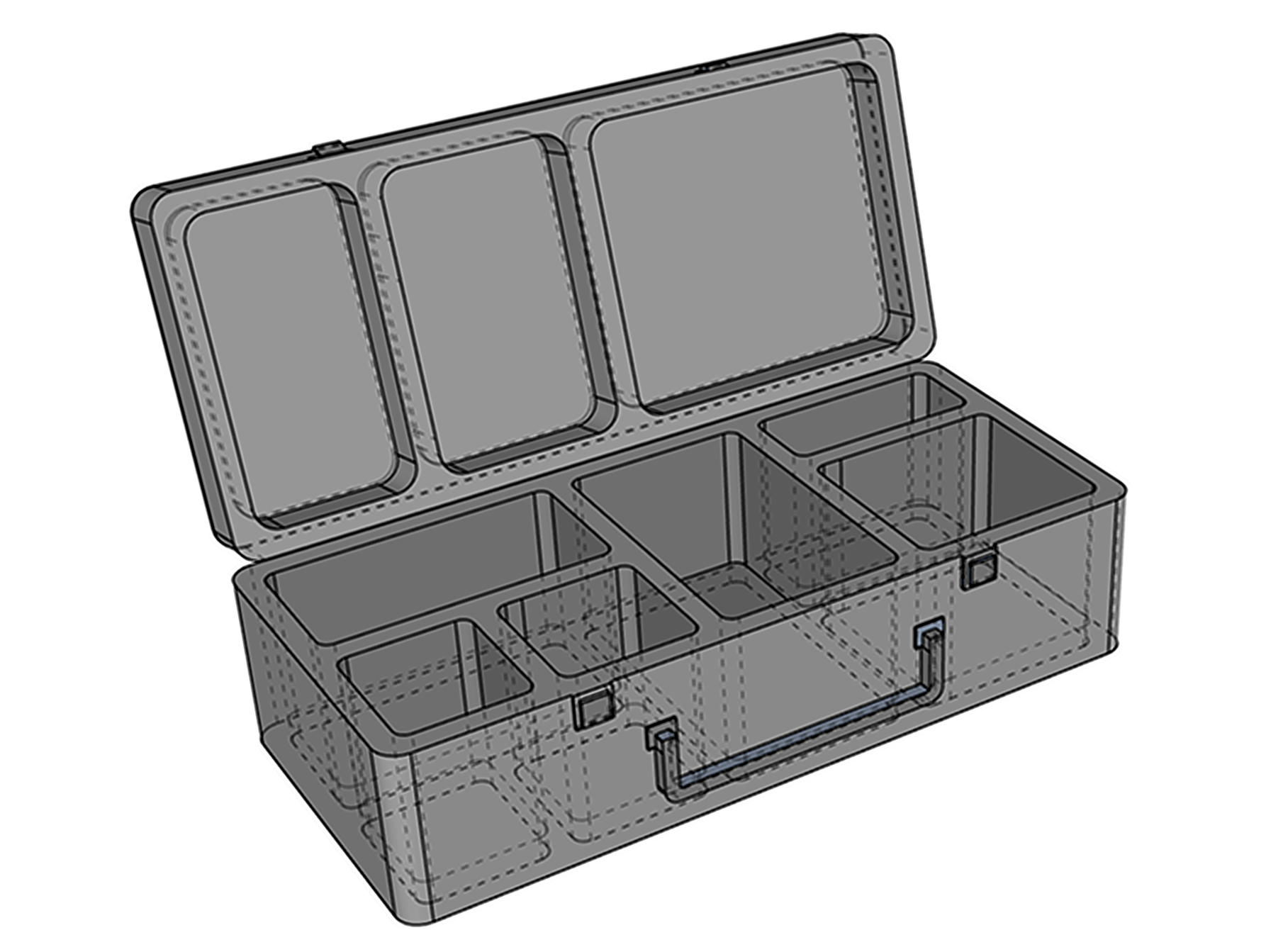
Insights and Next Steps
The toolbox addresses gaps in rural healthcare by providing essential tools for telemedicine, supporting users with varying digital literacy levels. Its modular design allows it to be tailored to individual or community needs, bridging the gap between physical and digital healthcare access. However, after exploring cost-effectiveness, I realized this outcome is not feasible.
Design Development
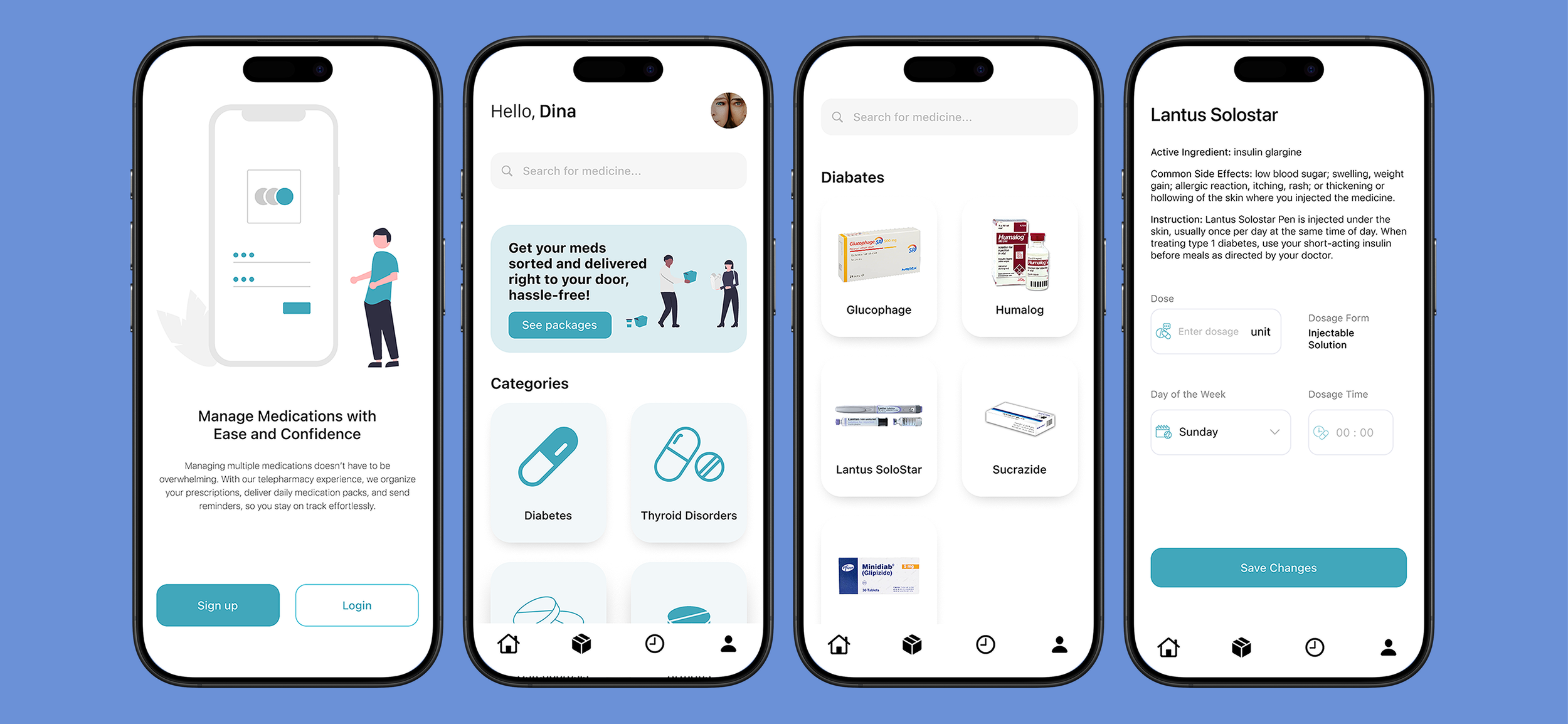
This week, I focused on designing a user interface for an app that lets users order medication bottles, integrating feedback from previous activities. While some may prefer non-digital options, the app offers a choice for those who prefer using technology, complemented by physical components.
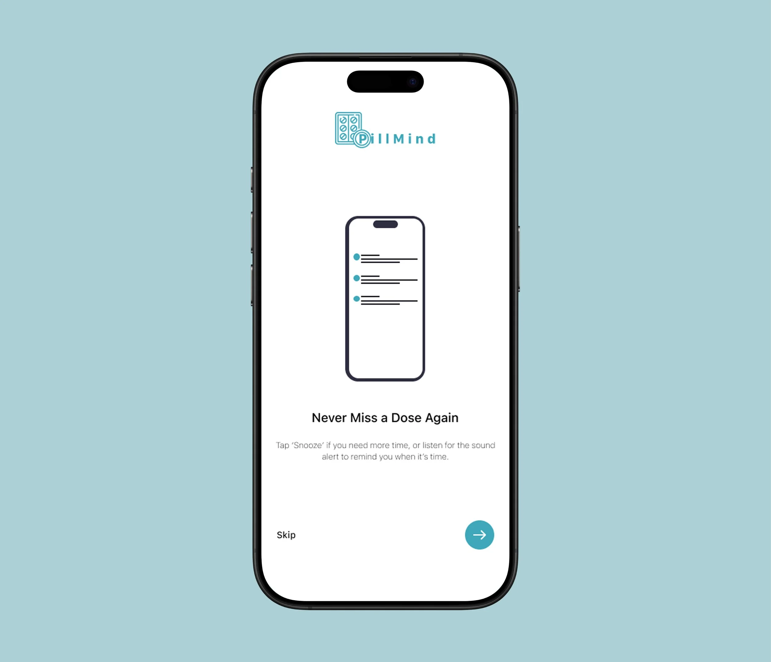
I lost focus on my project while exploring too many aspects like medicine delivery, reminders, and adherence. Previously, I aimed to design an experience for managing medications and reminders. However, after secondary research, I found that forgetfulness is a major reason for poor adherence. Yet, I believe simple reminders aren't enough. From personal experience, I rely heavily on alarms for tasks, including taking medicine, but if my medication isn't readily available when the alarm rings, I tend to snooze it or ignore it altogether. I decided to focus solely on adherence.
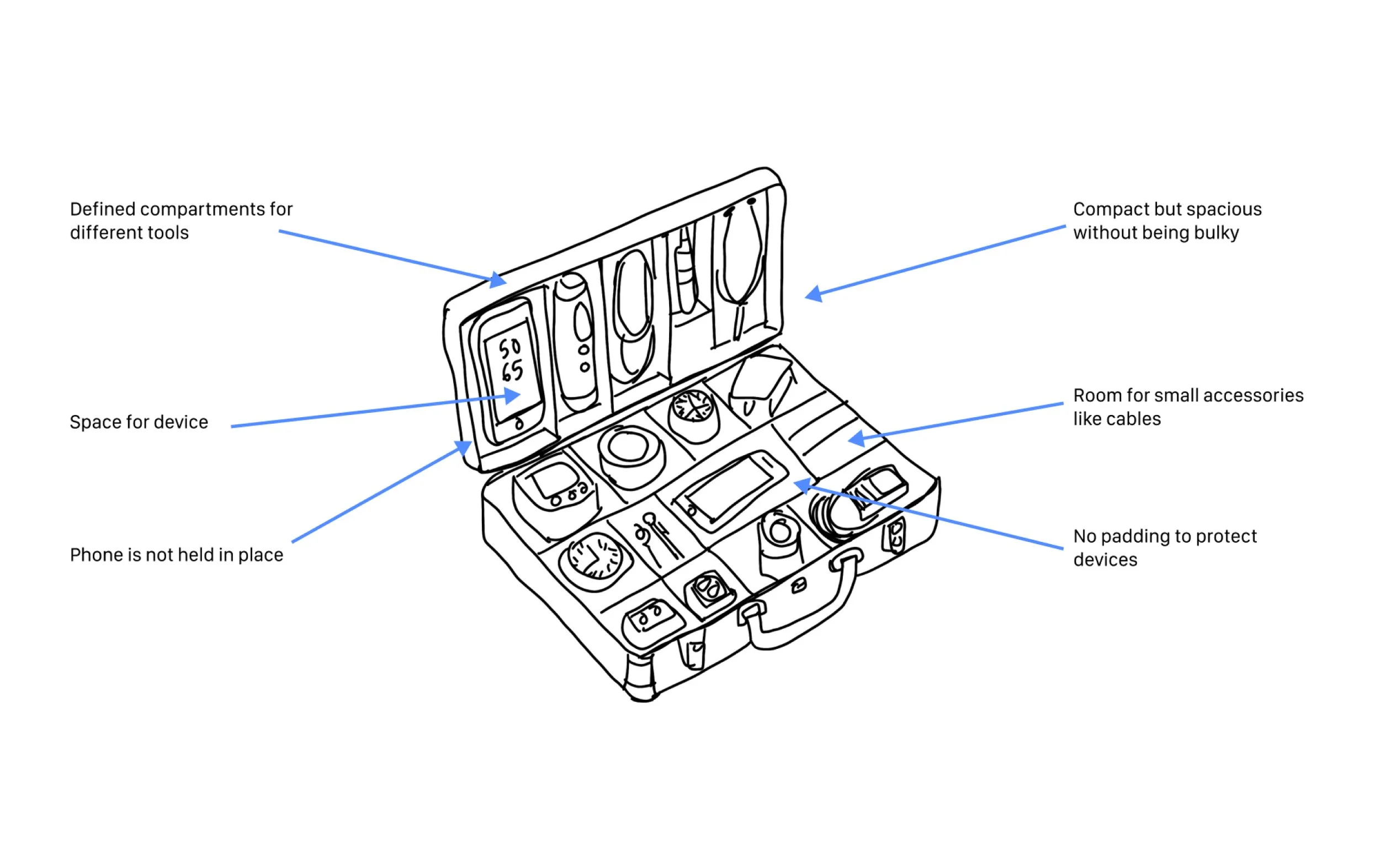
3D Modelling (CAD)
Not portable, too big to be available at all times and needs to be compact
User Journey
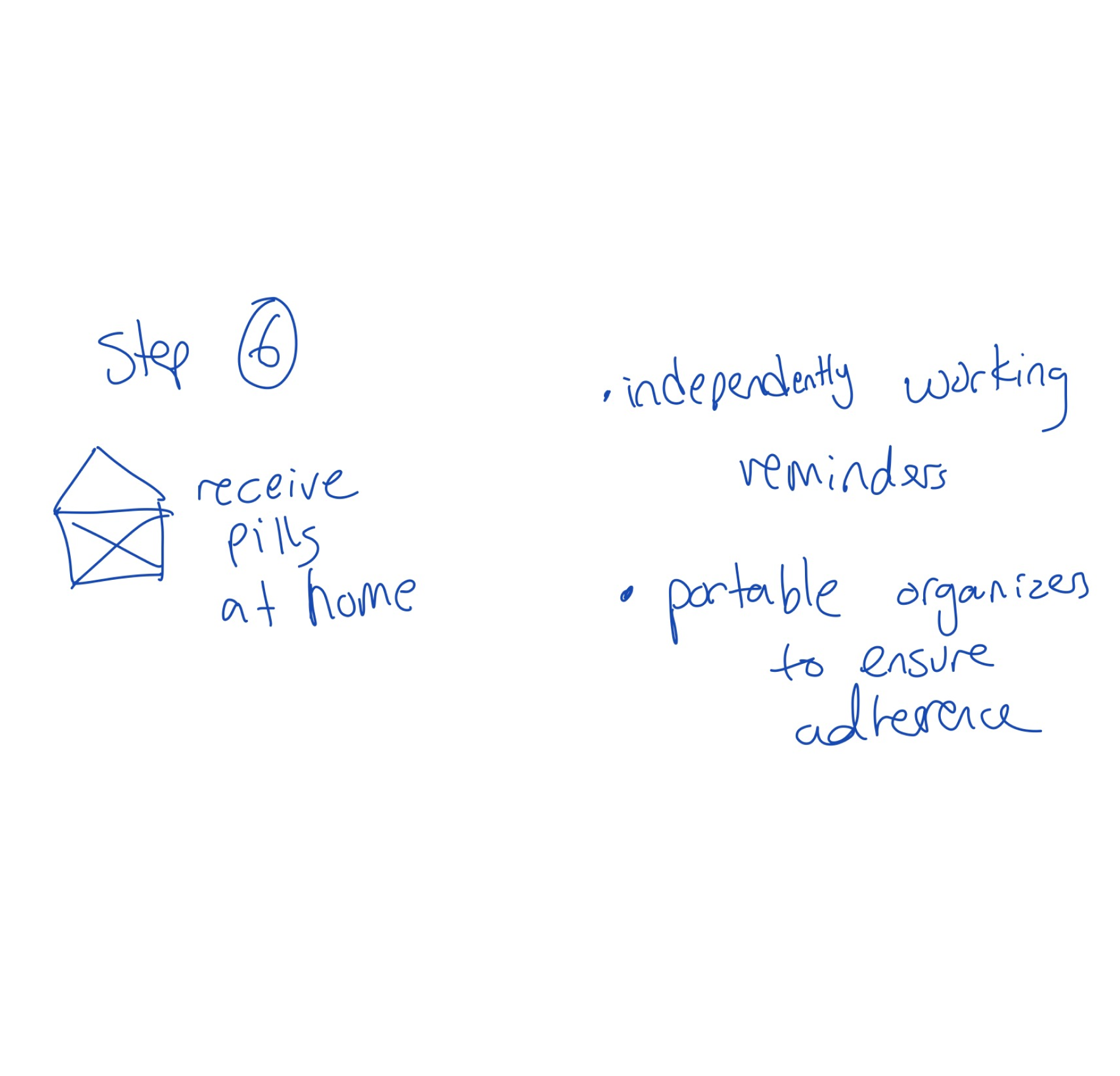
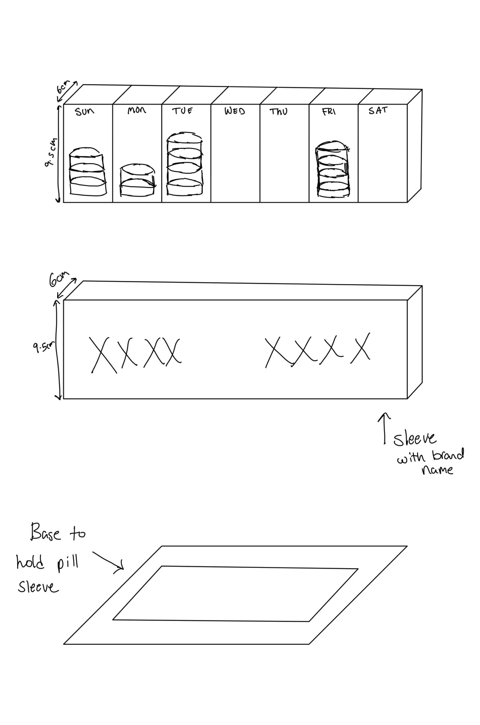
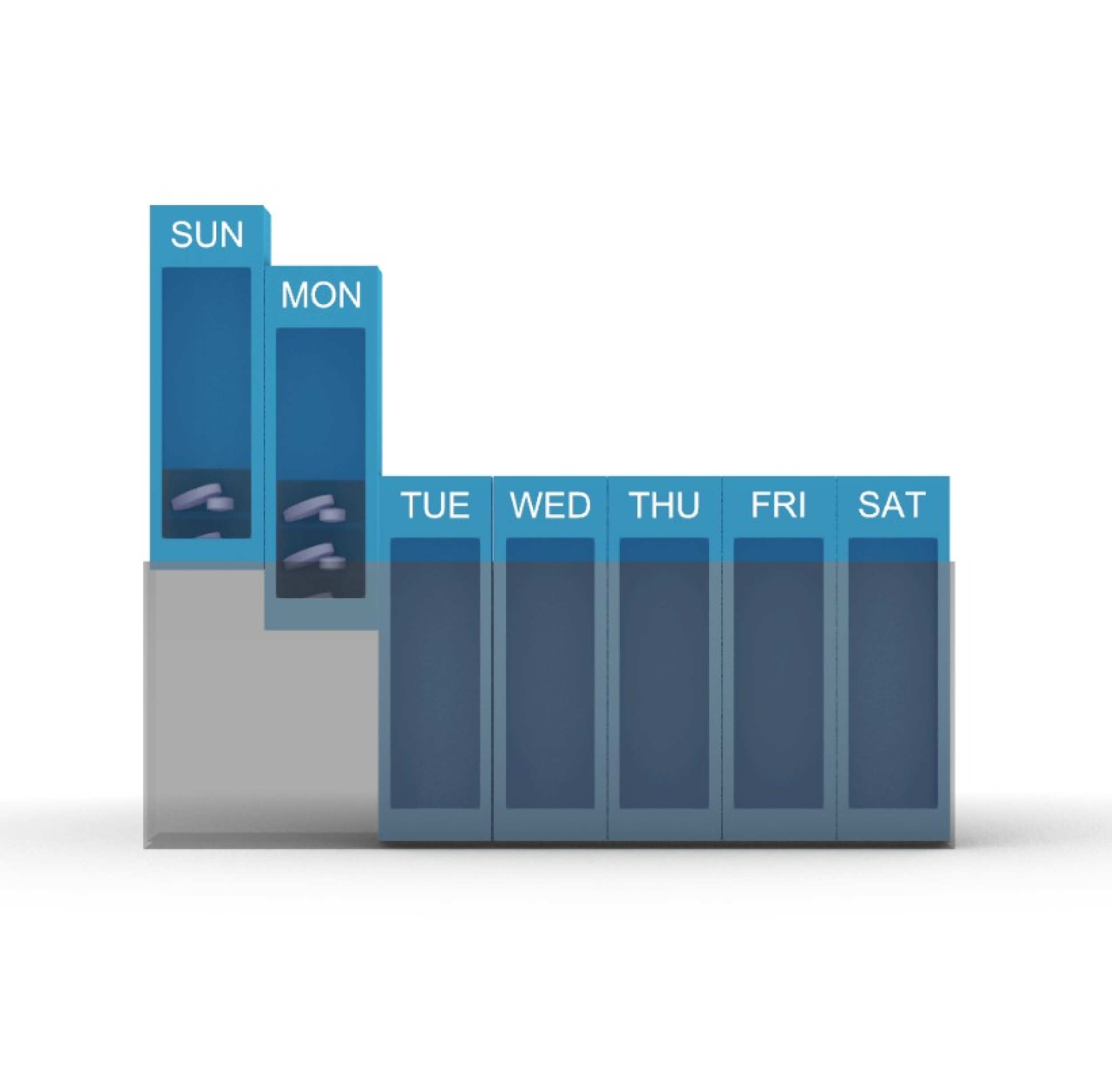
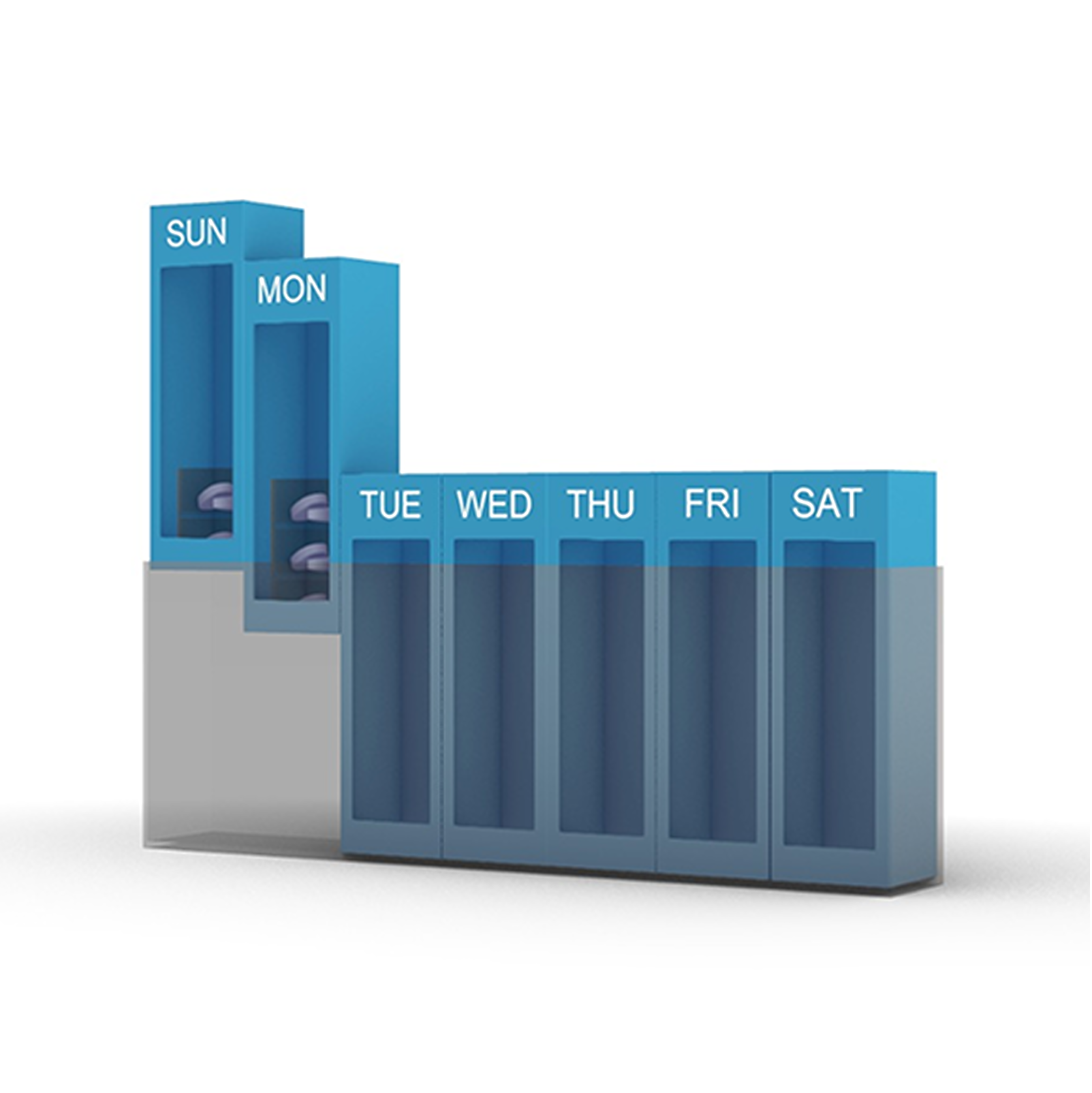
Round Pill Organizer
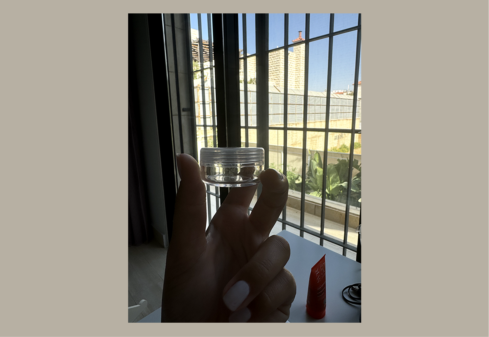
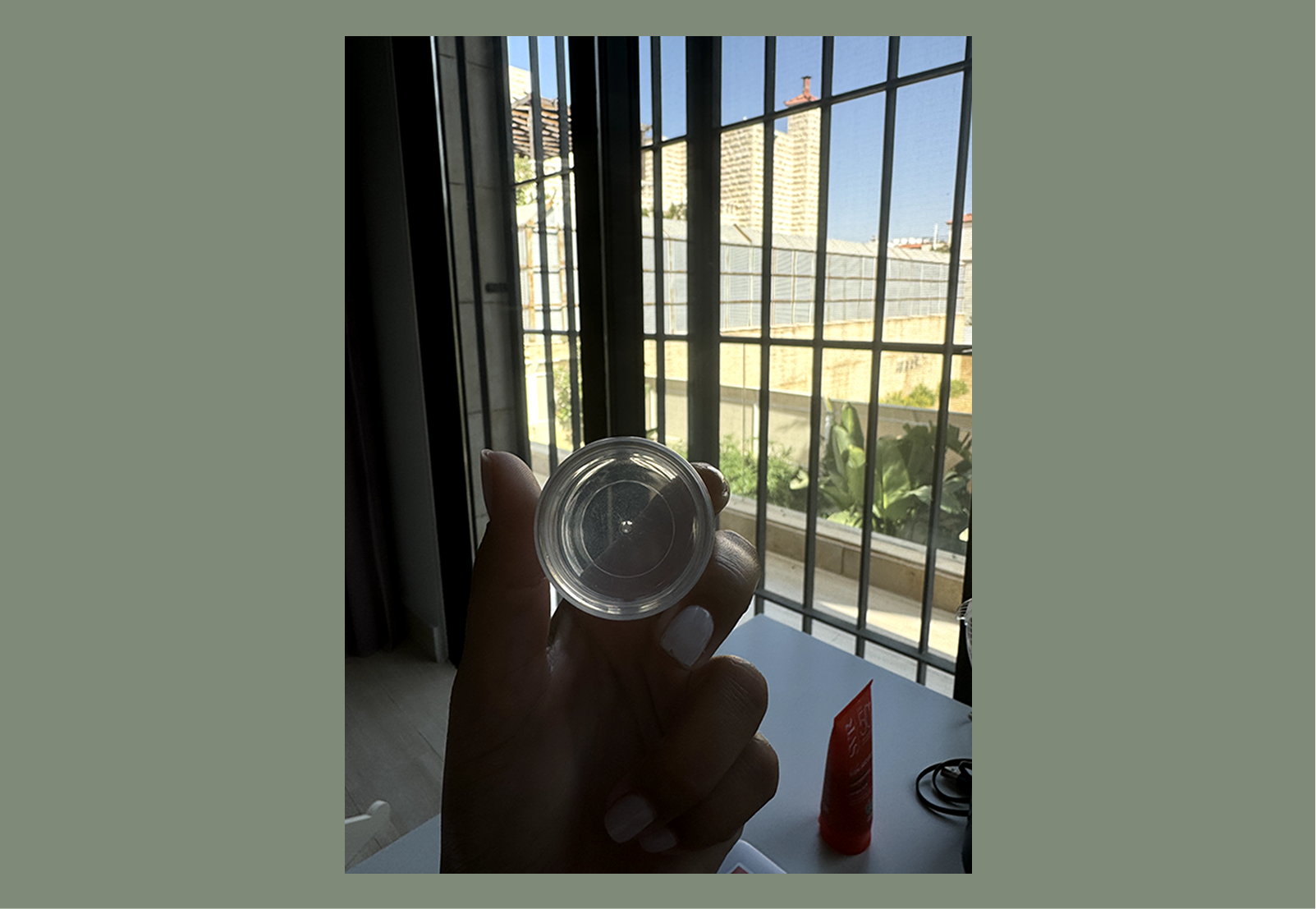
I decided to use a 3.7 cm diameter round pill case, with one pill case per day.
Limitations: The size is too small to fit all the necessary information about the pills.
Conclusion: I will design a small foldable, removable piece of paper that includes details about the medicines, dosages, and times to be taken. The back of the paper will feature a QR code that can be scanned for more information.
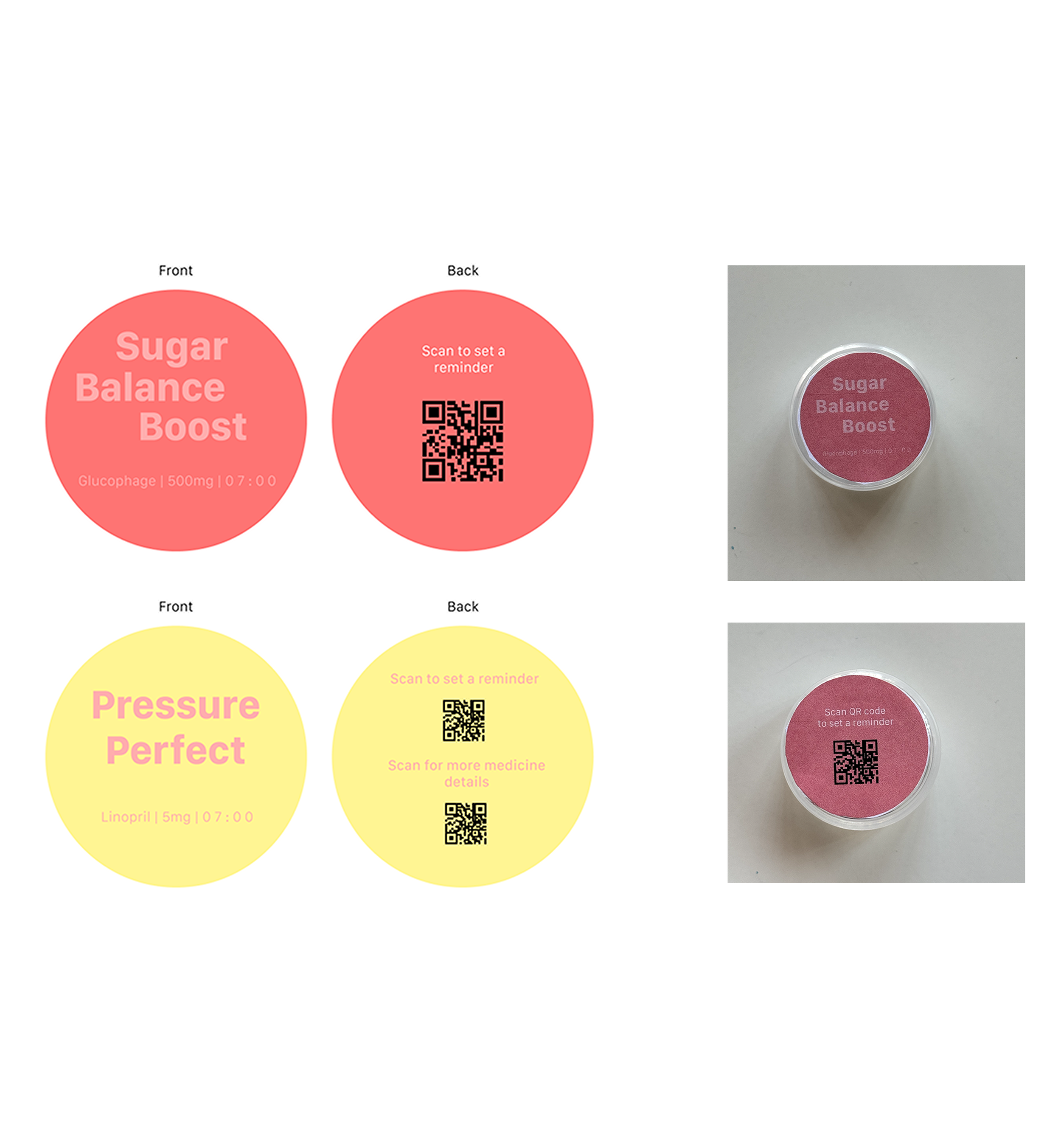
Details
Made a sample design to determine the colors, font sizes and font colors
Completing the User Interface
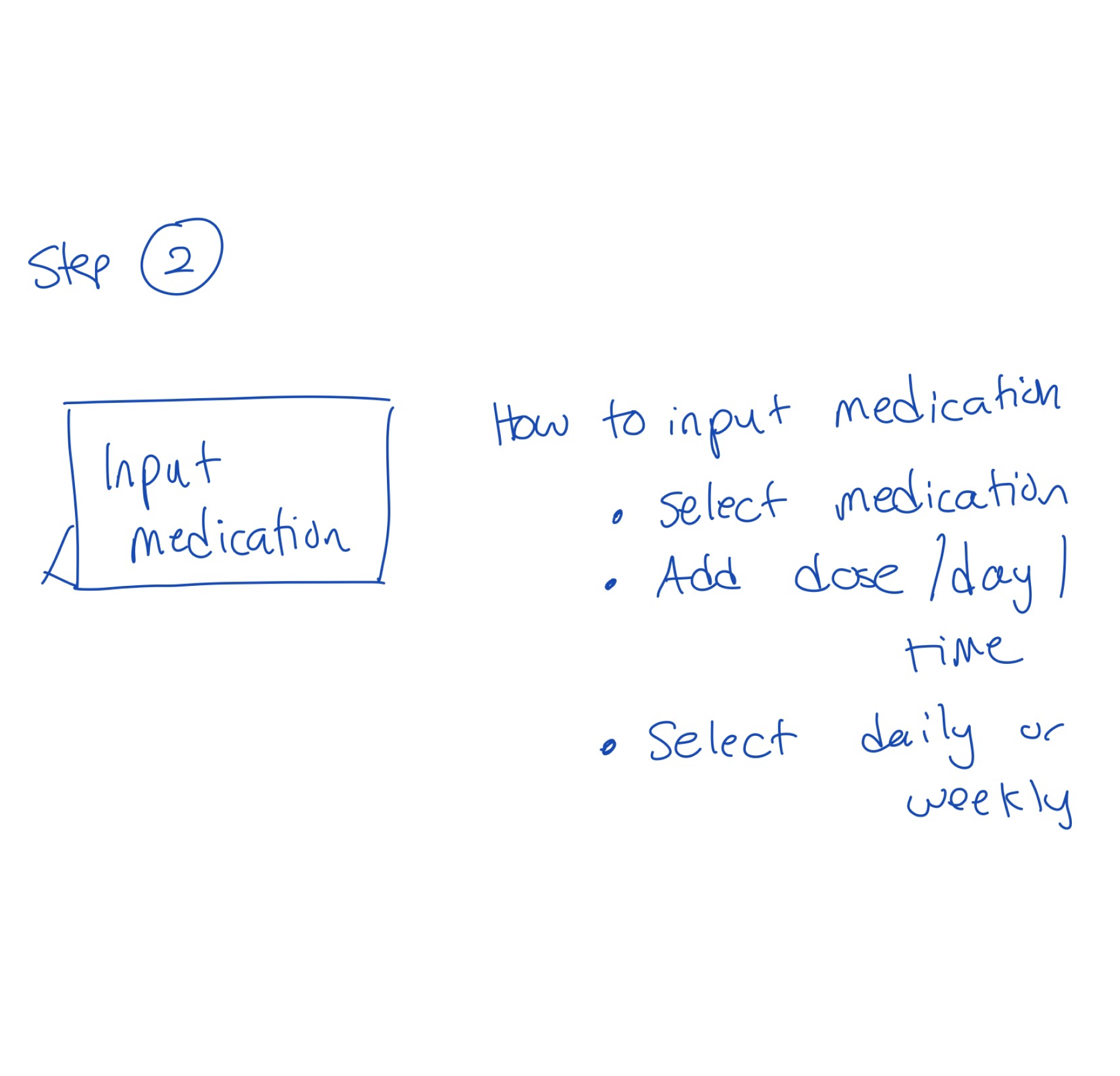
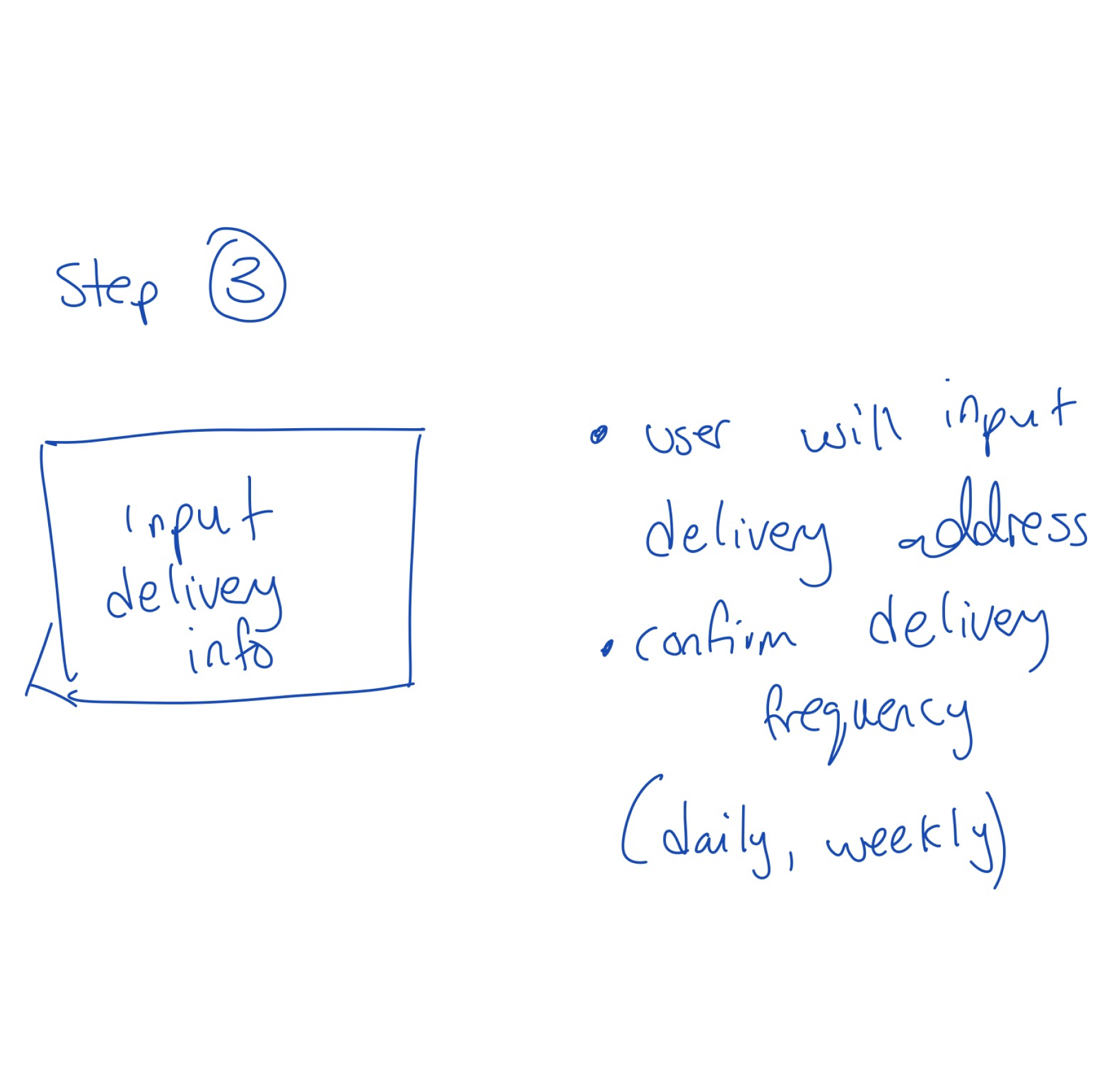
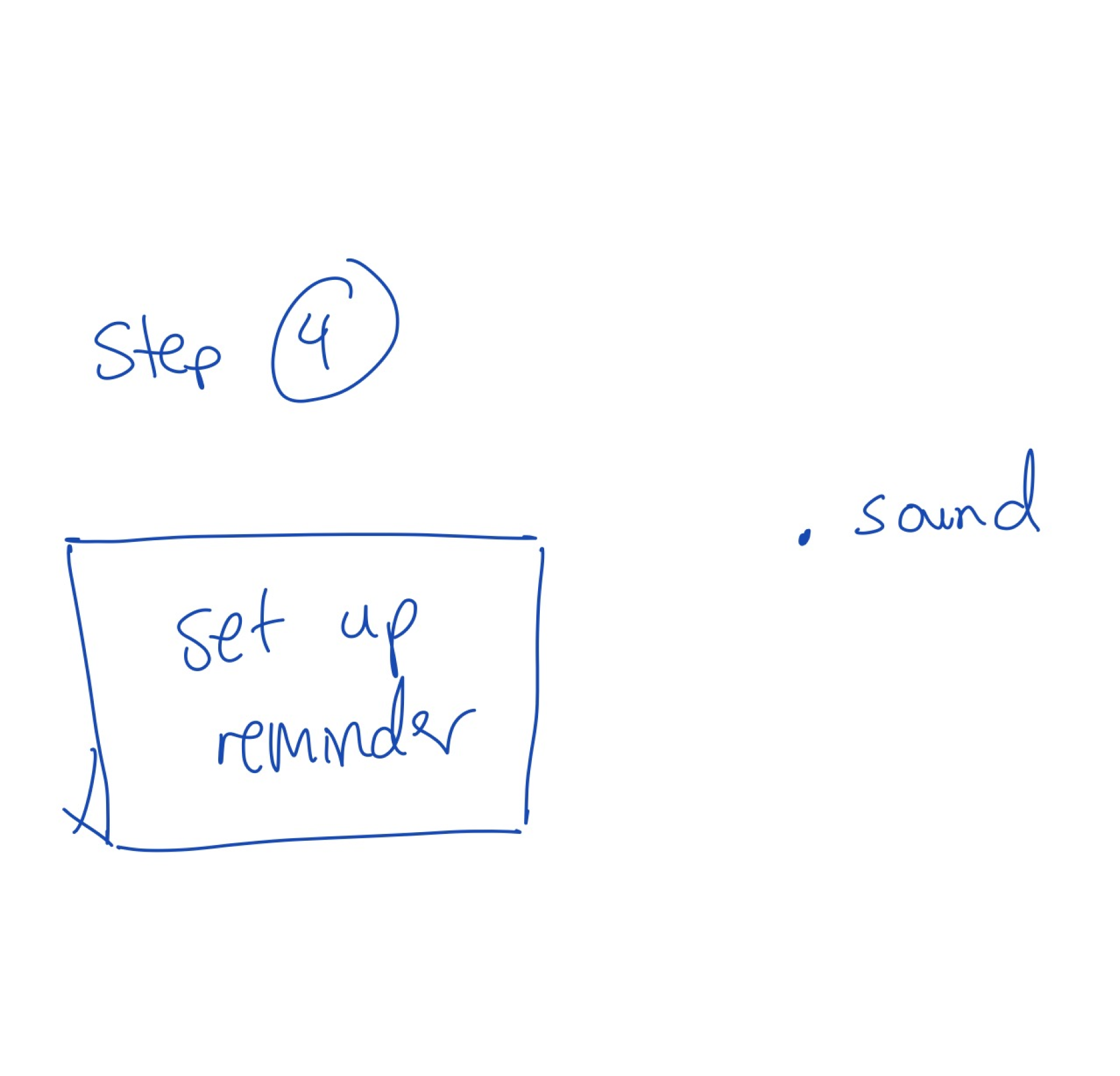
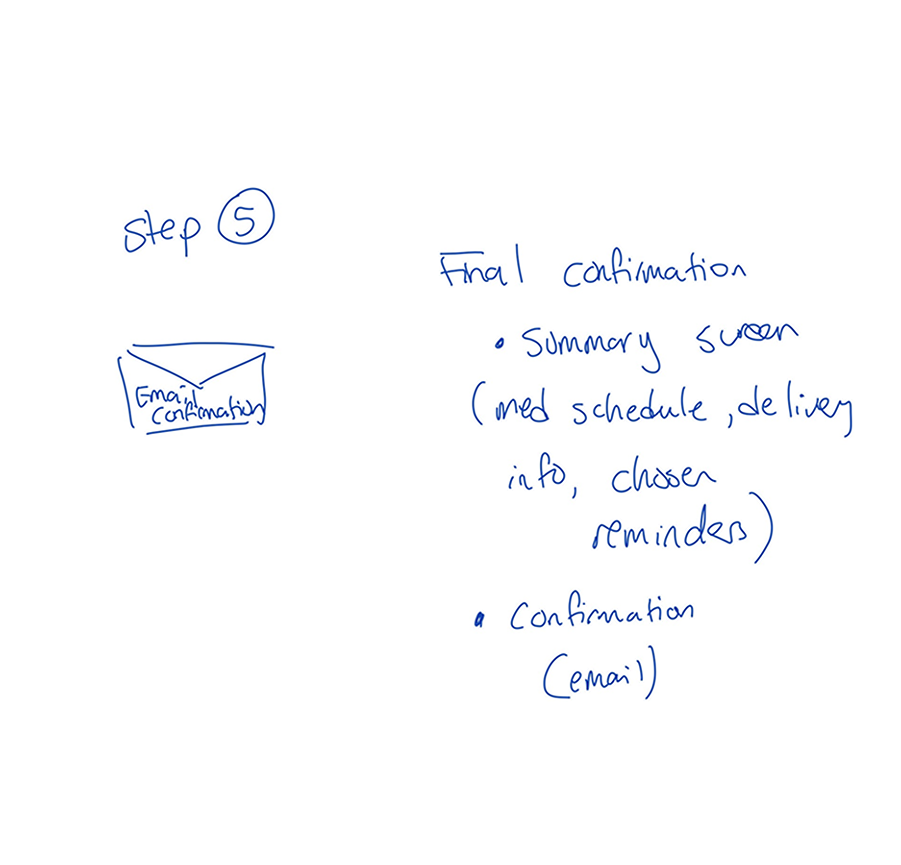
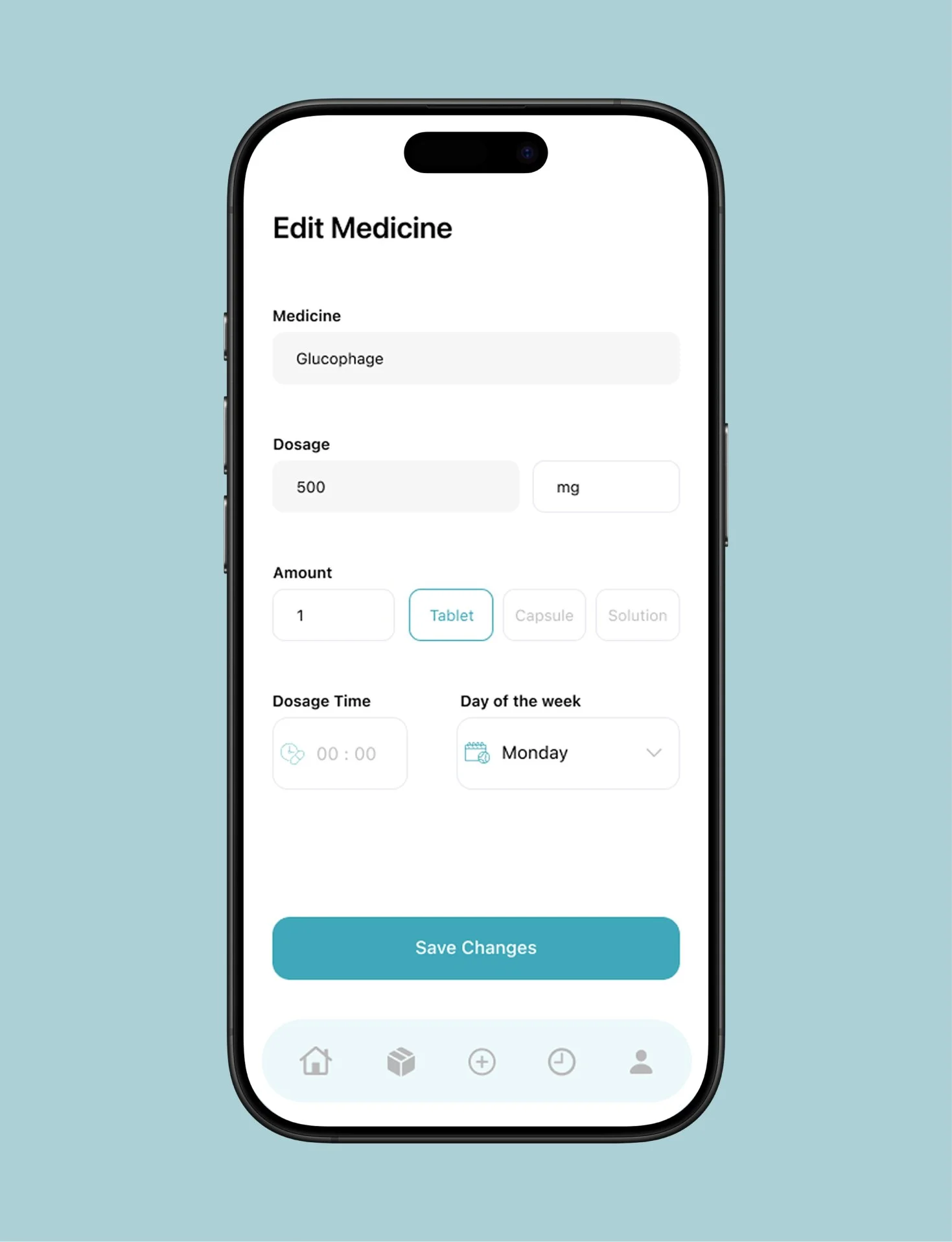
The next step was completing the user interface designs.
The rest of the design included medication reminder screens, adding reminders and editing them.
Usability Testing
Using insights from my research, I focused on implementing practical design solutions that would resonate with the target demographic.
Critical Analysis: Through usability testing, I observed that some users needed clearer labels and simpler layouts, which I adjusted to reduce cognitive load and enhance navigation.
Iterative Testing and Adjustments: The process was highly iterative, involving frequent testing and refinement based on user feedback.
Clear and Concise Articulation of Design Choices: The user interface and feedback systems were designed to communicate clearly and effectively with users.
In my design, I used simple language and clear iconography to guide users through the app’s functionality. Each interaction was designed to minimize confusion, with clear prompts guiding users on each screen. Additionally, I conducted user interviews to gauge the effectiveness of my communication approach, ensuring that every element of the UI was easily understandable, even for users with limited tech experience.